Mutual Funds Experience at Raiffeisen Bank app
Background
Mutual funds are an easy and effortless way to invest savings for those who don’t want to spend a lot of time on research and asset management. When I started working in Raiffeisen, mutual funds were already available to buy offline in the branches and on the website.
The business task was to implement mutual funds in the app to attract new customers, provide an easy way for clients to invest in funds and manage their investments. Therefore, the success metrics of the new section were:
- The number of new clients
- The number of purchases
Users
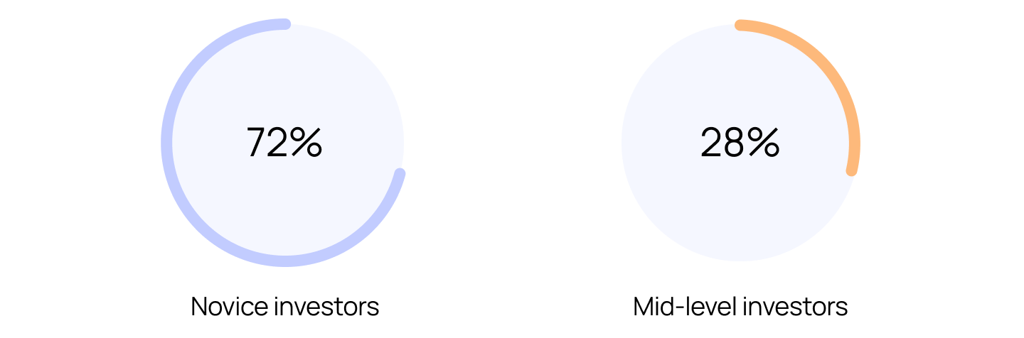
According to client statistics, there were two main target groups of mutual fund customers:
- Novice investors who mostly use bank deposits to save their money
- Mid-level investors who had experience with trading apps so they are used to the UX patterns of trading apps, which differ from mutual funds.
Research
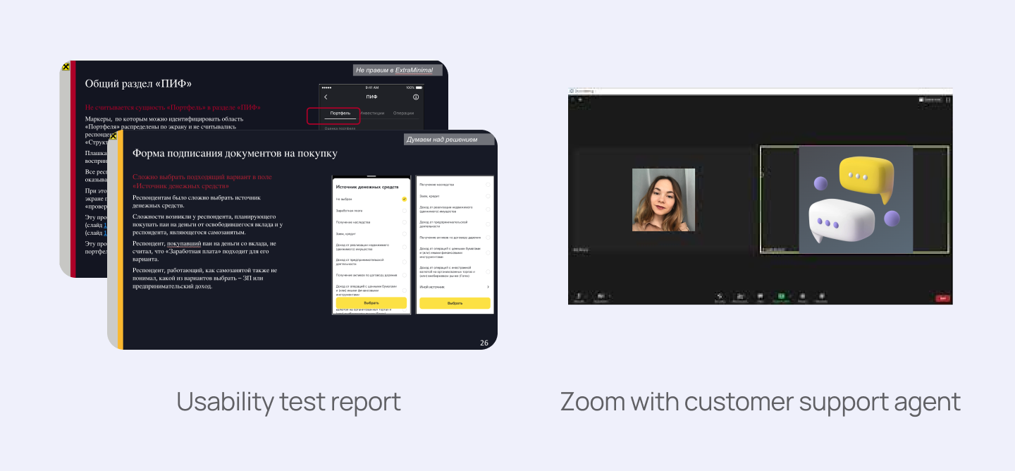
When I joined the team, the first version of the funds section was designed and a UX researcher conducted an in-depth usability test. I started by carefully analysing the usability test report. Then, I interviewed a customer support agent to learn what problems mutual fund customers face.
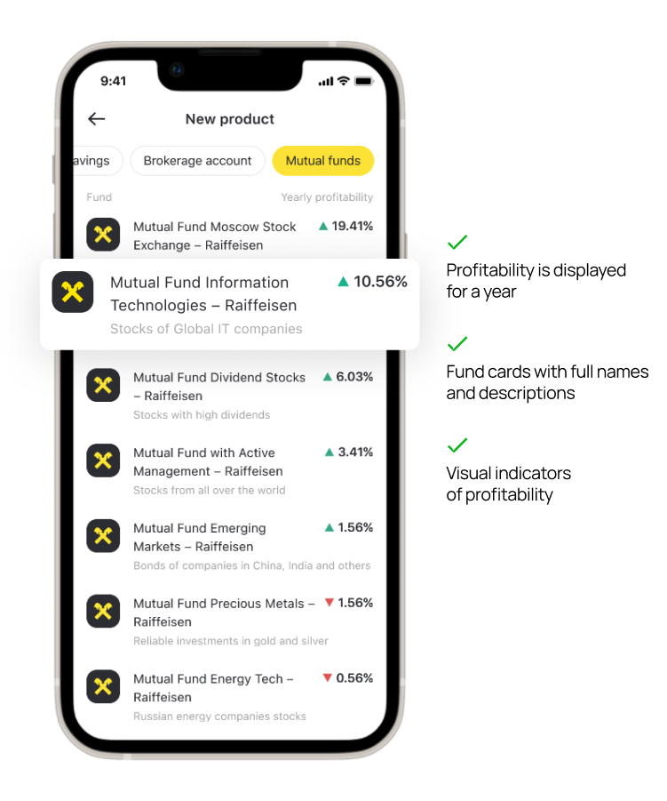
Key improvements: catalog of funds
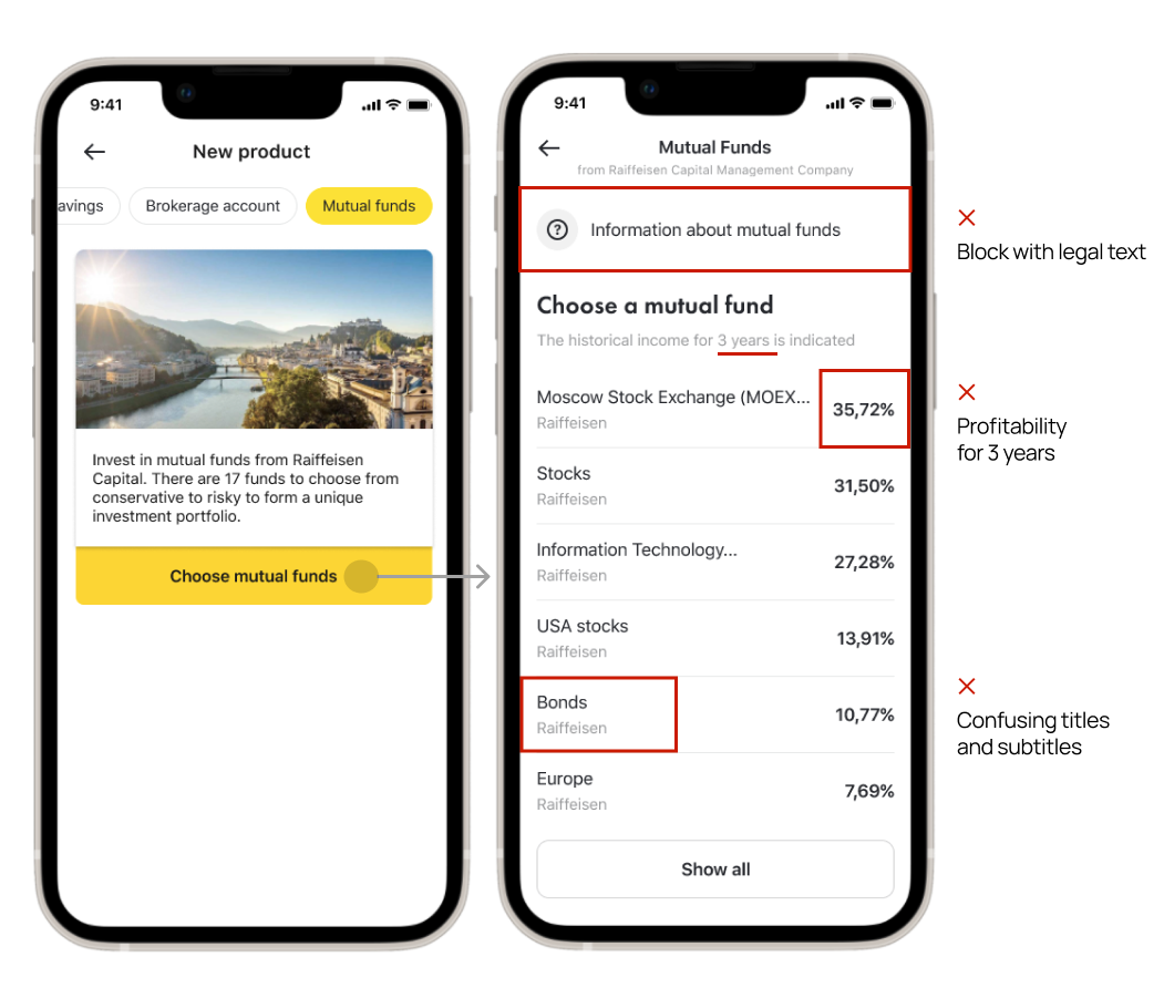
From the main screen of the banking app, users get to the process of opening a new product, which in this case is mutual funds. The following improvements were made based on the results of the usability test:
- The initial version had an extra step before users could access the list of funds. In the new version, it has been removed to shorten the user’s journey.
- I added the full name of the fund to avoid confusion. For example, in the initial version, users thought that “Bonds” were bonds from Raiffeisen Bank, not a bond fund.
- Short descriptions of the funds have been added so that users can get a brief idea of the contents of the funds.
- Changed the way the fund’s profitability is shown from 3 years to 1 year, as users requested.
…and other enhancements shown below.
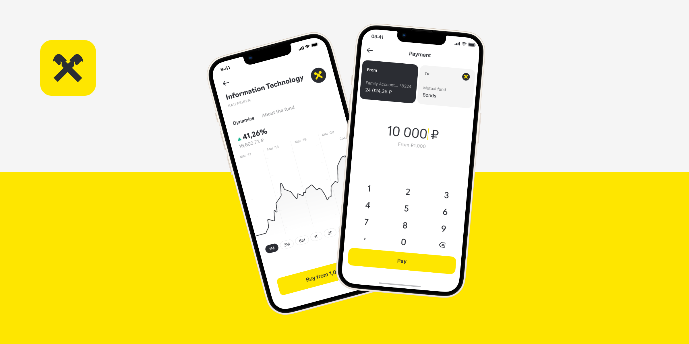
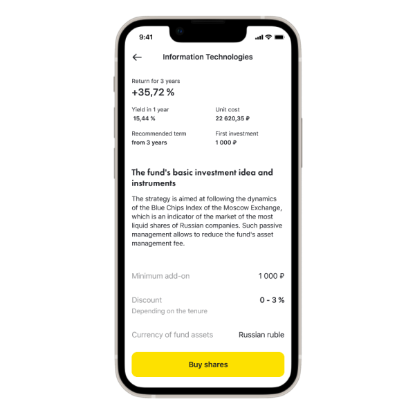
Fund page
After selecting a fund, users are taken to the fund page. The usability tests revealed some valuable insights:
- Lack of information. Users needed more information about the fund to make informed purchase decisions. They wanted detailed profitability data across various periods, not just for 3 years, and more detailed information about the fund’s assets.
- Unclear terms. Users found the terms of use and fees to be unclear, leading to hesitation in investing in a product they couldn’t fully grasp.
Based on this feedback, I completely redesigned the fund page with the following
improvements:
- I added a dynamic chart, enabling users to observe the fund’s performance across different periods.
- I introduced a tab with the key characteristics of the fund, investment strategy, and transparent fee structure.
- To ensure transparency in the terms of use, the complete list of fees was displayed.
Agreements and signing the documents
Before purchasing the mutual funds, the user needs to sign the documents and accept the agreement. This must be done to comply with regulations by the Central Bank.
Main problems from usability tests
- Users did not expect that they would need to fill in the form to purchase funds.
- The form was poorly structured, with unnecessary blocks. The blocks where the user needed to fill in the information were mixed with the blocks where the user just needed to confirm that the data is correct.
Improvements
- The flow starts with an overview of the next steps.
- The form was broken down into easy steps; redundant questions and confusing options were removed.
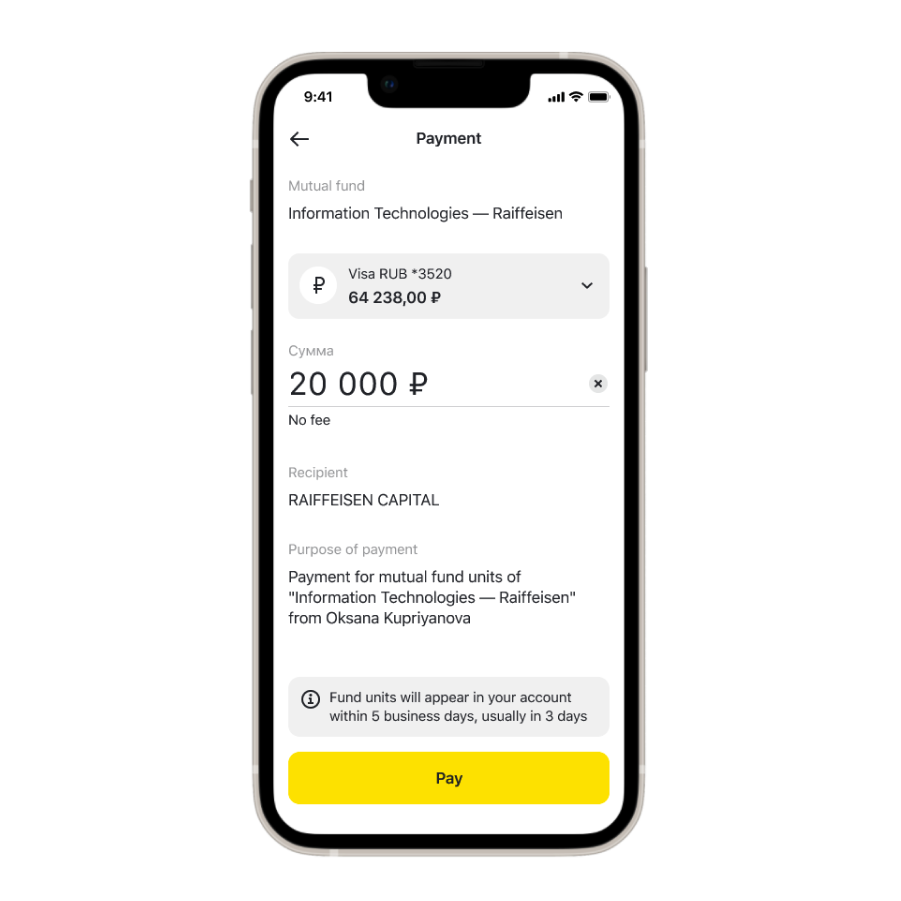
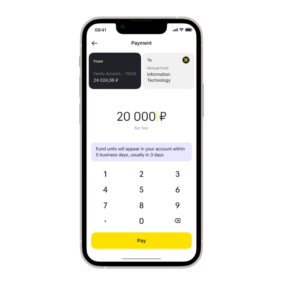
Payment
Payment is the last step in the purchase flow. The main user problem with the initial version was that users did not see the information about non-instant transactions and complained to customer support after the purchase.
In the new version, I removed unnecessary blocks and thereby increased the visibility of the info message. Also, together with our design system team, we designed a new payment screen which I reused in mutual funds.
Results
Together with the team, we released the first version of mutual funds in April 2021 and then iteratively improved the UX. Key results to December 2021:
- 5K+ new customers came through the app and invested in funds more than $XM. This is 67% of all clients who came for the same period from different channels.
- 70% of all purchases from all channels were made in the app.
Now available to all Raiffeisen customers in iOS & Android apps.